“One of the advantages of being disorderly is that one is constantly making exciting discoveries.”
A. A. Milne
Let’s load the training data into a Jupyter Notebook so we can look at it, explore it a little (and my guess is), do some data cleansing on it as well.
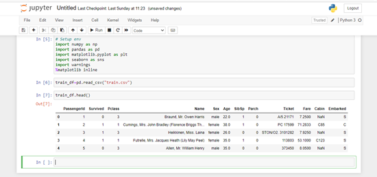
I’ve built a fairly generic envornment using Anaconda3. I will use ‘numpy’, ‘pandas’, ‘seaborn’ and ‘matplotlib’.
# Setup the environment
import numpy as np
import pandas as pd
import matplotlib.pyplot as plt
import seaborn as sns
import warnings
warnings.filter
%matplotlib inline
Now let’s read the data and load into a dataframe:
#Read the file
train_df=pd.read_csv("train.csv")
If we look at the data types in the file:

The fields are:
PassengerID : Integer : Counter/Identifier to a particular passenger record
Survived : Integer : Flag for whether passenger survived or not (0= died, 1=survived)
Pclass : Integer : Accomodation class of the pasenger (1 = 1st, 2= 2nd, 3= 3rd)
Name : String : Passenger's name (including salutation)
Sex : String : Gender of the passenger (male/female)
Age : Float : How old the passenger was on date of embarkation (in years)
Sibsp : Integer : Number of siblings or spouses aboard
Parch : Integer : Number of parents or children in same party aboard
Ticket : String : Ticket number/ticket identifier
Fare : Float : Amount paid for passage
Cabin : String : Onboard cabin number/identifier
Embarked : String : Port of embarkation (C= Cherbourg, Q= Queenstown, S= Southampton)
Now let’s take a look at the data in terms of where we have missing data:
# Count null fields and display the counts
train_df.isnull().sum().sort_values(ascending = False)
This gives us:
Cabin          687
Age            177
Embarked         2
PassengerId      0
Survived         0
Pclass           0
Name             0
Sex              0
SibSp            0
Parch            0
Ticket           0
Fare             0
dtype: int64
We have missing data in three fields:
- Cabin – A lot of missing data, don’t think it will prove useful to predict anything. I may drop this column
- Embarked – I will populate with most common value
- Age – I will build some age bands later, for now I will fill with the median age
# Populate the embarked field
train_df['Embarked'].fillna(train_df['Embarked'].mode()[0], inplace = True)
# Populate age field with median values intitially
train_df['Age'].fillna(train_df['Age'].median(), inplace = True)
Enriching the Data
I am going to add the following fields:
- Family Size – number of passengers in a family
- Age Band – assign every pasenger to a particular age band
- Fare Band – assign passengers to a particular fare band
Tickets on the Titanic were broadly priced
First Class Suite- £870 or $4,350
First Class Berth- £30 or $150
Second Class- £12 or $60
Third Class- £3 to £8 or $40
I found the ticket prices from Titanic: The Whole Iceberg
Create the FamilySize field
#Create FamilySize column
train_df['FamilySize'] = train_df['SibSp'] + train_df['Parch'] +1
Create the Fare Bands
# Put fares into bins
train_df['Fare_band'] = pd.cut(train_df['Fare'], bins=[0,7.91,14.45,31,120], labels=['Low_fare','median_fare', 'Average_fare','high_fare'])
Create the Age Bands
# Put ages into various bins
train_df['Age_band'] = pd.cut(train_df['Age'], bins=[0,14,20,40,120], labels=['Children','Teenage','Adult','Elder'])
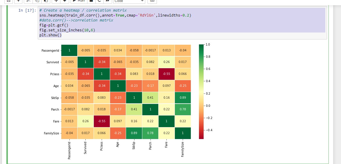
So the data should be in a good (enough) state to start mining, Just to get an early look, here is a heatmap
#Create a heatmap / correlation matrix
sns.heatmap(train_df.corr(),annot=True,cmap='RdYlGn',linewidths=0.2)
# data.corr()-->correlation matrix
fig=plt.gcf()
fig.set_size_inches(10,6)
plt.show()